Your link in bio should be a storefront, not a menu
A list of links sends attention away. A storefront converts it. Here is how to restructure your link in bio page so it actually sells.
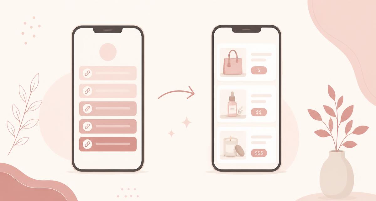
The standard link in bio page was designed for a problem that no longer exists. It was built to solve “I have one link and five destinations” - a routing problem. So it became a menu: a stack of identical buttons whose entire job is to send the visitor somewhere else.
That made sense when everything you did lived on another platform. It stops making sense the moment you have something to sell, because a menu optimizes for the click, and a click is not a sale. Every hand-off to another site is a place where attention leaks out.
What the menu costs you
Picture the actual sequence a buyer goes through on a typical link page. They tap your bio link, scan seven buttons that all look the same, guess which one is the product, tap it, wait for a new site to load, land on a checkout that looks nothing like your brand, and then get asked to create an account.
That is five separate moments where a distracted person on a phone can leave, and most of them are not decisions about your product at all. They are friction. The fix is not better copy on the buttons. It is removing the hand-offs.
What a storefront does differently
A storefront page inverts the priorities:
- Products look like products. Image, name, price, one clear action. Not a button with the same shape as your Instagram link.
- Money happens on the page. Checkout opens where the visitor already is, no redirect and no account creation.
- Links are supporting cast. Your socials still exist, just underneath the things that earn.
- Delivery is instant. The file, the course access, or the booking confirmation arrives immediately, while enthusiasm is at its peak.
The word “storefront” is doing real work here. A shop is arranged so the thing for sale is visible from the door. A menu is arranged so everything is equally likely.
How to restructure your page in an afternoon
- Put one product above the fold. Whatever a first-time visitor should buy, it goes at the top - above your socials, above your newsletter, above the podcast. Only one. Competing offers at the top produce no decision at all.
- Give it a real image. A product with a visual gets noticeably more attention than a text button. A cover mockup, a screenshot, a photo of you holding the thing - all fine.
- Show the price. Hiding it does not increase clicks from serious buyers, it increases clicks from people who then leave. Price is a qualifier, and qualified traffic is the point.
- Group with section headers. “Shop,” then “Work with me,” then “Follow.” Headers let visitors skip to the part they came for instead of reading fifteen identical buttons.
- Add one email capture. Place it after the products. It is your insurance policy against every algorithm change to come.
- Cut everything else. If a link has not been tapped in three months, it is costing you attention. Delete it.
The five-second test
Open your page on your phone and look at it for five seconds, the way a stranger would. Can you tell what is for sale and what it costs? If not, the page is still a menu.
The two objections we hear most
“It will feel too salesy”
Selling feels aggressive when it interrupts. A storefront does not interrupt - the visitor arrived by choosing to tap your link. They are already at the door. Making it obvious what you offer is a service, not a pitch. Pages that feel pushy usually got there through urgency timers and fake scarcity, not through clear pricing.
“My audience is too small for this”
Small audiences are the strongest argument for a storefront, not against it. With modest traffic, every visitor matters more, and conversion rate is the only lever you fully control. A thousand well-converted visits beat ten thousand that bounce through a redirect.
Building one
This is exactly what xoxo.bio is shaped around: product cards with real images and prices, checkout that opens on your page, instant delivery, section headers to group things, email capture blocks, and plain links for everything that genuinely lives elsewhere. Payments run through your own Stripe account and the platform takes 0% of your sales.
You can rebuild your page and test a live purchase during the 21-day trial before you change your bio link. Details on the pricing page, or read our guide on how to sell digital products if you have not picked your first product yet.
One link. Everything you sell.
Downloads, courses, bookings, and memberships with checkout on the page - and 0% platform fees on every sale.
Start your 21-day trialKeep reading

How to sell an online course without a course platform
Course platforms are built for course businesses. If you are a creator with an audience, here is a lighter setup that still delivers video properly.
Read
Creator platform fees explained: what you actually keep
Platform cut, processing fees, payout timing, and the costs nobody lists on the pricing page - with the math for working out your real take-home.
Read